|
|
Post by Junior on Jul 19, 2007 12:55:01 GMT -6
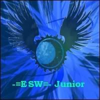
Well, i made this using a paint program i have, but when i finished it i looked at it for a moment and wondered what it was missing... Any suggestions?  |
|
|
|
Post by azrael37 on Jul 19, 2007 13:30:52 GMT -6
I think it looks good overall. I would remove that center picture and put your name in the center, using some Word Art, making it bigger. Finally, move that picture on the left, all the way to the left. That's assuming you want to keep these pictures and just slightly edit the tag.
I think the main reason it feels like it's missing something is because it almost looks just black and white. You may need some more color, or make the current colors more bold.
|
|
|
|
Post by Junior on Jul 19, 2007 15:43:15 GMT -6
I think it looks good overall. I would remove that center picture and put your name in the center, using some Word Art, making it bigger. Finally, move that picture on the left, all the way to the left. That's assuming you want to keep these pictures and just slightly edit the tag. I think the main reason it feels like it's missing something is because it almost looks just black and white. You may need some more color, or make the current colors more bold. So your saying get rid of the girl, move the blue haired guy the the left and put "-=ESW=- Junior" in the dead center of it? |
|
|
|
Post by azrael37 on Jul 19, 2007 19:37:43 GMT -6
Yeah, or maybe just add some busy image to the background, like a shot of a city at night or something.
|
|
|
|
Post by Junior on Jul 19, 2007 19:54:57 GMT -6
Yeah, or maybe just add some busy image to the background, like a shot of a city at night or something. ahh!!! thats perfect! xD thx for the idea! |
|
|
|
Post by starlightrun on Jul 19, 2007 20:10:51 GMT -6
I really don't like the idea of your tag in the center to be honest. I think what you need is some more texture in the background, it looks off balance.
|
|
|
|
Post by Junior on Jul 19, 2007 20:15:16 GMT -6
Yea, the whole idea of it was the kids friends being faded into the darkness. (Dont ask, its from a game >.>) But like i siad, it felt empty. And yea, putting the name in the center is just bleh. COrners are the way to go with those... Ill try the city first, then post it and you guys tell me if its ok. Right now im trying to figure out was part of this picture : www.chocoboheaven.com/mc/displayimage.php?pid=1056&fullsize=1I should use. I was thinking about the bottom or the middle of the bottom half of it. (where the buldings end in the center.) |
|
|
|
Post by starlightrun on Jul 19, 2007 20:57:10 GMT -6
yah for sure, but fade it and make it ALOT more transparent
|
|
peekaboo
New Member
 I am the girl anachronism.
Posts: 22
|
Post by peekaboo on Jul 23, 2007 10:03:37 GMT -6
I really don't like the idea of your tag in the center to be honest. I think what you need is some more texture in the background, it looks off balance. agreed... it looks empty but not in a perfectly zen way. Either that or saturate the colors/adjust the levels of contrast a little more to make it pop out more. |
|
|
|
Post by socophreak on Jul 23, 2007 18:30:34 GMT -6
now i gotta make/host a sig for myself  |
|